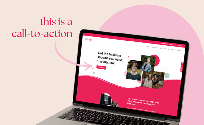
You know those buttons, prompts and links on your website that encourage your visitor to take a specific action?
Things like “call now”, “find out more”, or “subscribe to our newsletter”. These are calls-to-action, or CTAs, and they're an absolute game-changer when it comes to engaging your audience and turning them into loyal customers.
Why are CTAs so important?
They should also be integrated into all of your marketing material from email campaigns to social media posts, ads and blogs.
Why?
The average adult human makes an average of 35,000 remotely conscious decisions each day. A designer creating content for your website or other marketing channels is tasked with cutting through that decision overload and guiding your audience towards the actions you want them to take. This is where CTAs come in.
The purpose of a CTA is to guide the user to take the desired action, whether that's purchasing a product, signing up for a service, downloading a resource or making a booking.
Proper planning is important when creating CTAs. You have to determine the ideal path for the user, mapping out each step they should take. Whether that's a specific sequence of pages on your website, or from a social media post to a product page, plan it all out!
The best place for a CTA is at a decision point, like the end of a page, caption, presentation slide or video campaign. These decision points make it easy for your users to follow the suggested action, leading them down the desired path that you've set out.
To improve user experience, limit the number of options given at once by using only one CTA button. Having too many buttons can overwhelm the user and increase the number of conscious decisions they need to make.
The effectiveness of your CTA depends on various factors, primarily the audience that you're trying to target. Some audiences are naturally more open to following the paths we set out for them! Certain strategies can increase the appeal, and the likelihood that your CTA will be clicked:
Consider your language and tone when creating CTAs. Make them relatable, and spoken in the same tone as your target audience.
The visual look of a CTA will also impact it's effectiveness. Avoid making it appear too aggressively promotional. Instead, make it visually appealing to your target audience.
Optimising CTAs takes time, like any aspect of your marketing plan. Remember to build the trust of your user and subtly guide them towards a decision.
Do the CTAs and user paths on your website need work?
It might be time for a website audit. Book a call with our creative team or get in touch below, to find out more about how we can help enhance user experience, drive conversions, and show your business off to it's fullest potential.


